Full marketing website, UI design system, integration showcase, demo-booking funnel
Flourish Software is a unified, AI-enabled ERP platform built for cannabis operators. It covers cultivation, manufacturing, distribution, and retail POS, and connects with tools like METRC, BioTrack, QuickBooks, WooCommerce, and others. It serves over 1,000 brands, from small operators to large multi-state businesses.
The Challenge
Flourish had a powerful product, but their website needed to match the quality of the software. The client's goals were clear:
A modern, premium UI that matches the level of today's best SaaS platforms
Cannabis imagery without the dated look. Many cannabis sites rely on heavy stoner-style graphics, dark clichés, or cluttered stock photos. Flourish wanted real plant and product imagery used with restraint.
A clean, fresh visual feel that builds trust with serious operators and compliance teams
Clear presentation of many integrations, so a complex ecosystem feels simple and easy to understand
More demo bookings, with a clear path from first visit to booked demo
The core design problem was balancing two things that often conflict: an industry with strong visual associations and a modern, professional, tech-first identity.
The Solution
1. Fresh, Confident Visual Identity
Color palette: Deep navy for authority and depth, balanced with a vibrant green that nods to the industry without leaning on clichés, plus a warm amber/yellow accent for calls to action
Typography: Nunito, a rounded sans-serif that feels friendly and approachable while staying clean and readable
Generous white space and soft light-green backgrounds keep every section airy and uncluttered
Alternating light and dark sections create rhythm and guide the eye down the page
2. Smart Use of Cannabis Imagery
Instead of filling the page with photos, imagery is used in a few deliberate places:
Subtle plant illustrations in the hero and navy sections
Real, high-quality photography in the supply chain cards (cultivation, manufacturing, distribution, retail)
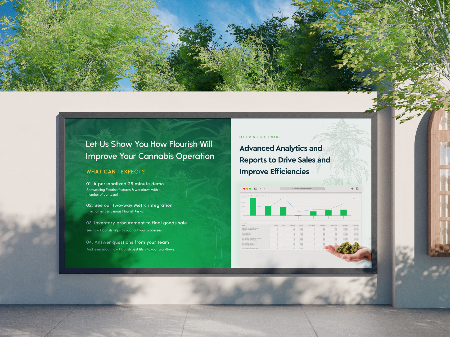
A hand holding cannabis in the demo-request section, a human and authentic moment
Soft green overlays that blend photos into the brand palette
This keeps the site feeling connected to the industry while looking like a modern tech product.
3. Integrations Made Visual
Flourish’s integrations are a major selling point, so they get premium treatment:
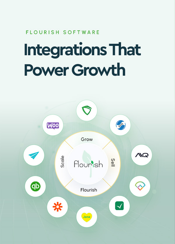
A hero composition of floating app icons around a product dashboard, showing the connected ecosystem right away
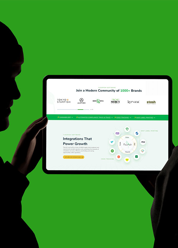
An orbital integration diagram with Flourish at the center and partner tools around it, organized by Grow, Scale, and Sell
Quick-access feature ribbons (Cannabis ERP, Automated Compliance Track & Trace, COGS Tracking, Easy Label Printing) repeated between sections for fast navigation
4. Product-Led Storytelling
Rather than describing the software in abstract terms, the site shows it:
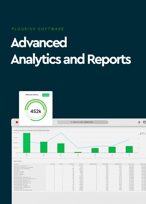
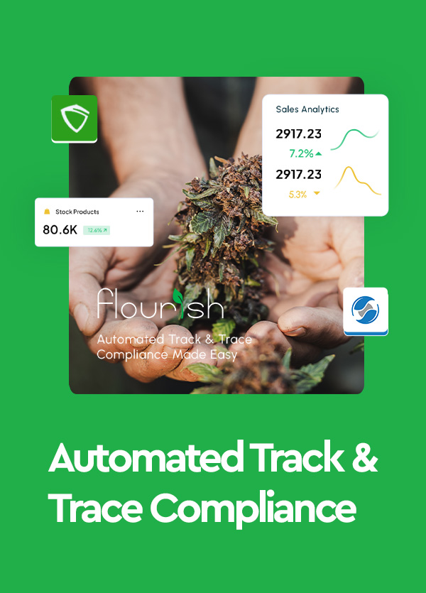
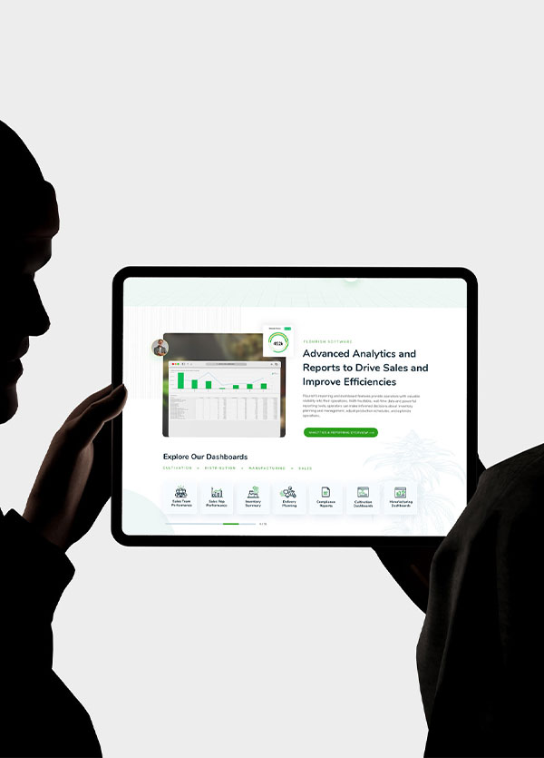
Real dashboard and analytics screenshots in clean device frames with floating stat cards (such as “452k” and “80.6K”)
An “Explore Our Dashboards” carousel covering Sales Team Performance, Inventory Summary, Delivery Planning, Compliance Reports, and more
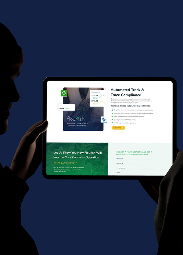
A dedicated Track & Trace Compliance section highlighting the two-way METRC integration, automated syncing, audit logs, and queuing to reduce downtime
5. Clear Structure Across the Supply Chain
A four-card section, Cultivation, Manufacturing, Distribution, and Retail POS, lets visitors see their own part of the business and understand the full platform at a glance. Each card has concise feature bullets and a clear action button.
6. Conversion-Focused Journey
“Book Demo” buttons in the header and in every major section
Social proof early, with a logo carousel of brands such as Tokyo Starfish, Alpine, Baked Bros, Mercy, Kurvana, and Stash
A demo form section that sets expectations with a clear four-step “What can I expect?” list: a personalized 25-minute demo, a look at the Metrc integration, a view of inventory-to-sale workflows, and a Q&A with the team
A short, simple form to reduce friction
I designed and built a website that treats cannabis as a supporting visual element rather than the main theme. The interface leads, and the imagery supports it.
Limited, curated photos with green tint and illustration accents
Floating icons and orbital diagram instead of long lists
Real dashboards, client logos, and compliance-focused content
Consistent amber CTAs and a guided demo section
Results & Impact
Replace the placeholders below with real figures if you have them.
A cleaner, more premium brand perception that matches the sophistication of the product
Improved clarity around integrations and compliance features
Higher engagement with a clearer path to booking a demo: [X% increase in demo requests]
Better user experience across devices: [X% improvement in time on site / reduction in bounce rate]
Summary
For Flourish Software, I built a website that shows the brand as modern, trustworthy, and technically capable. By keeping cannabis imagery subtle and putting a clean interface, clear integrations, and real product visuals at the center, the site feels as advanced as the software it represents, and it gives cannabis operators a straightforward path from "Who is Flourish?" to "Book a demo."